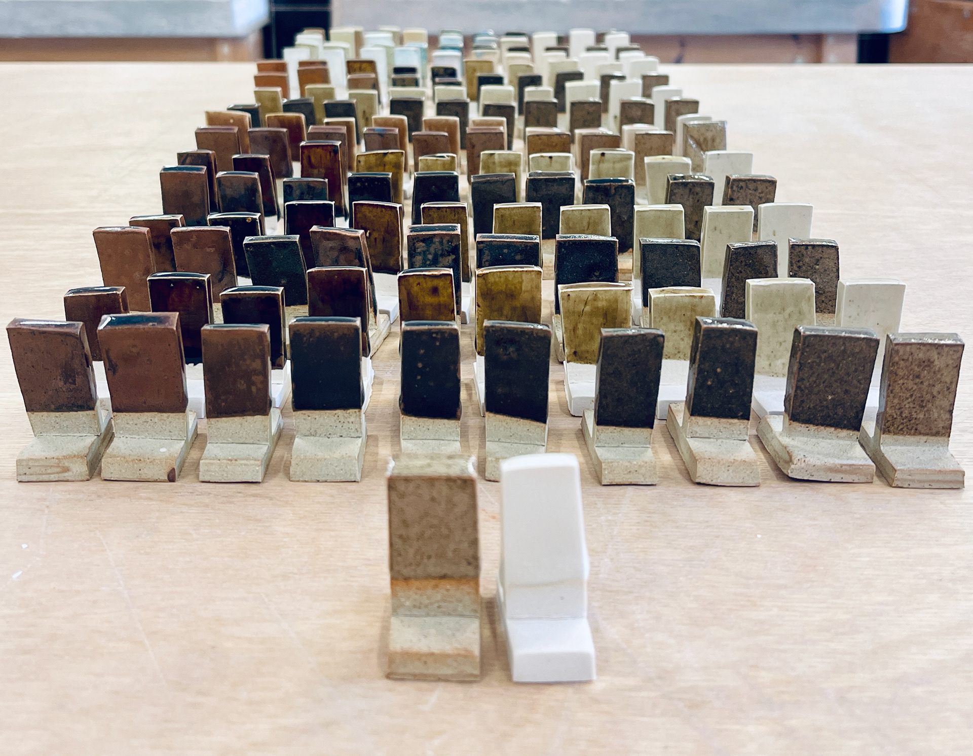
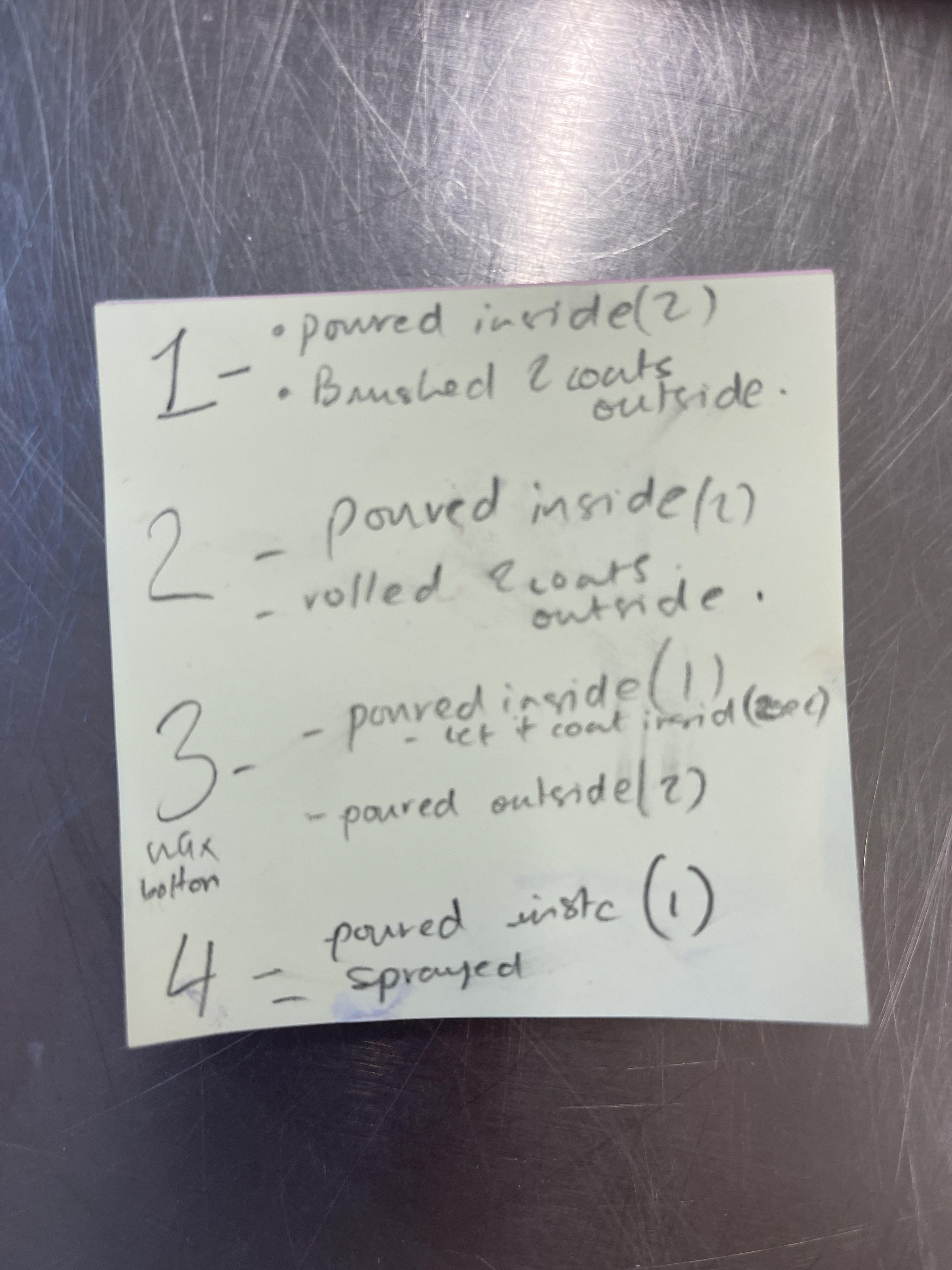
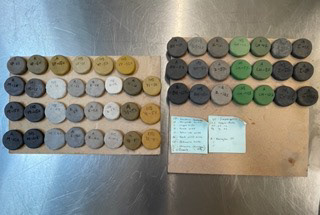
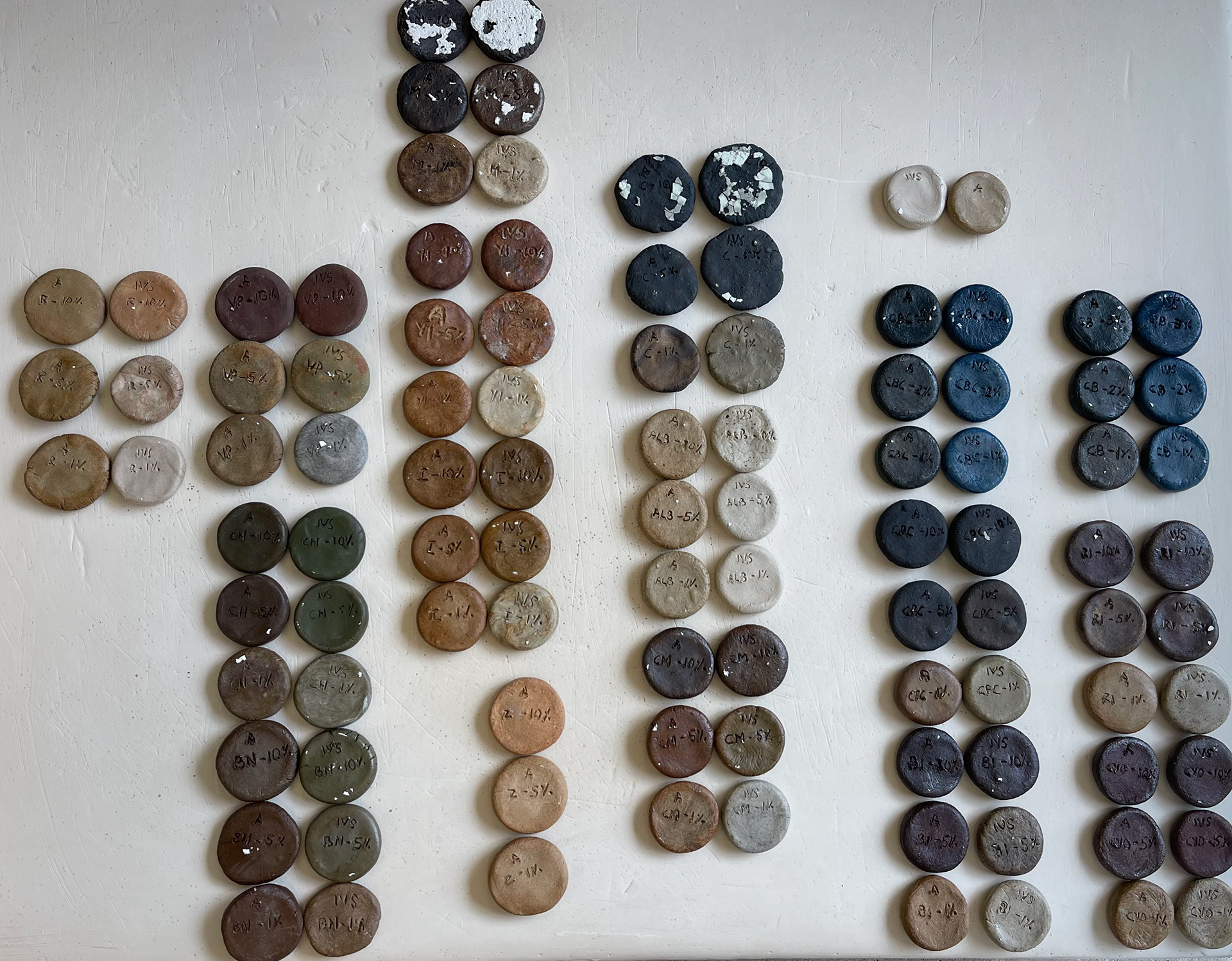
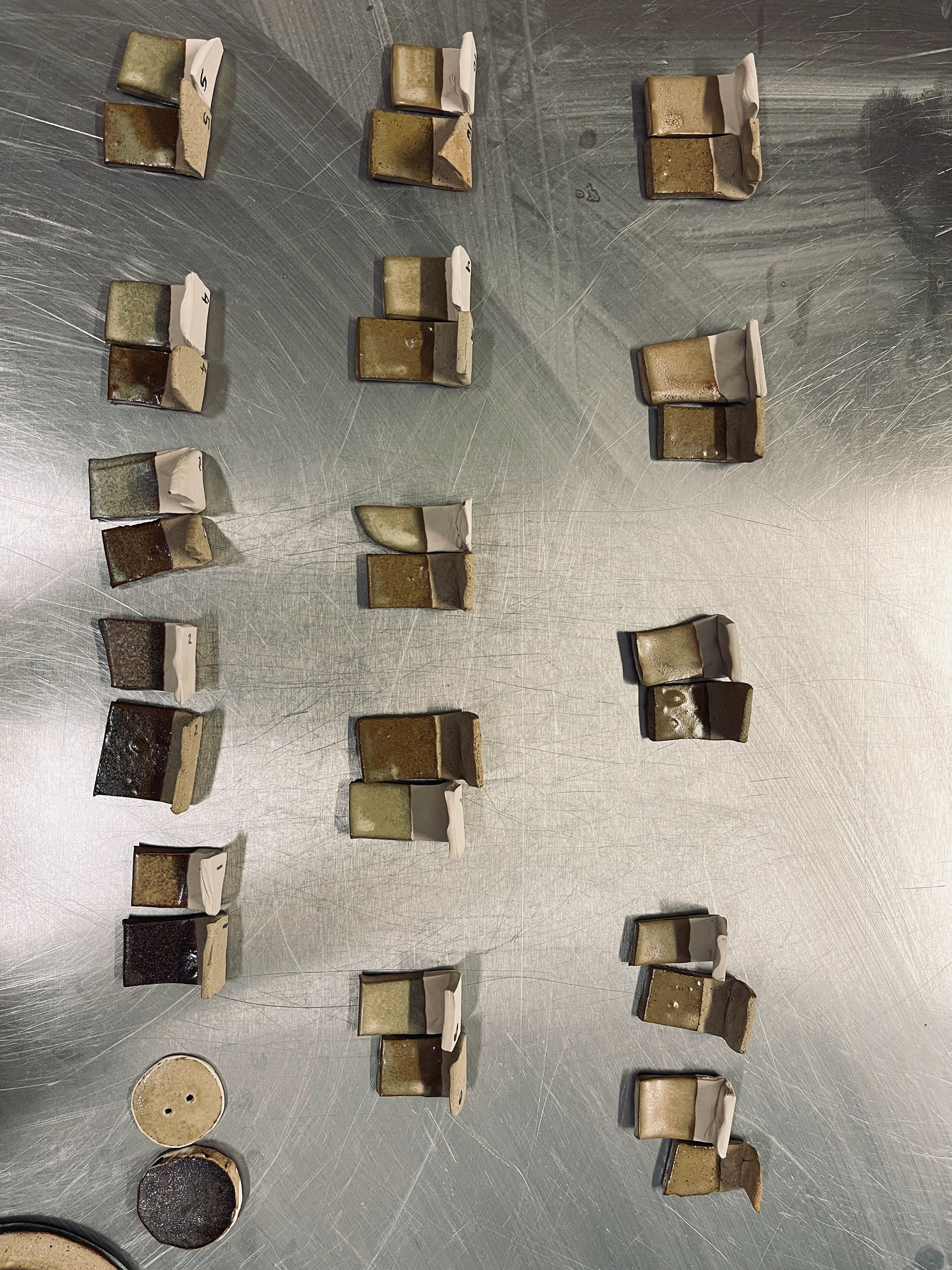
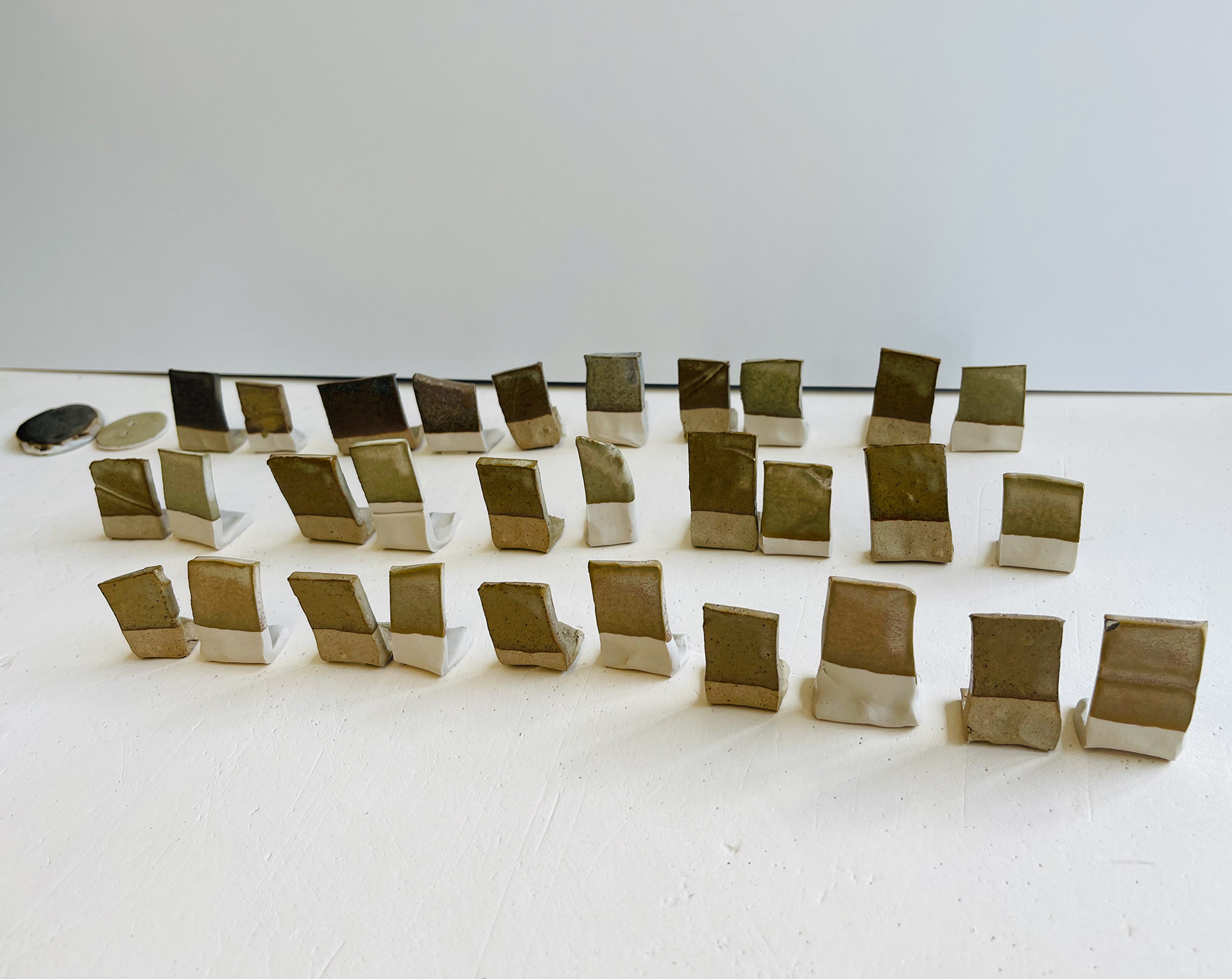
left: two rows are tests that are fired to cone8, right: row has been fired to cone9 temperature.
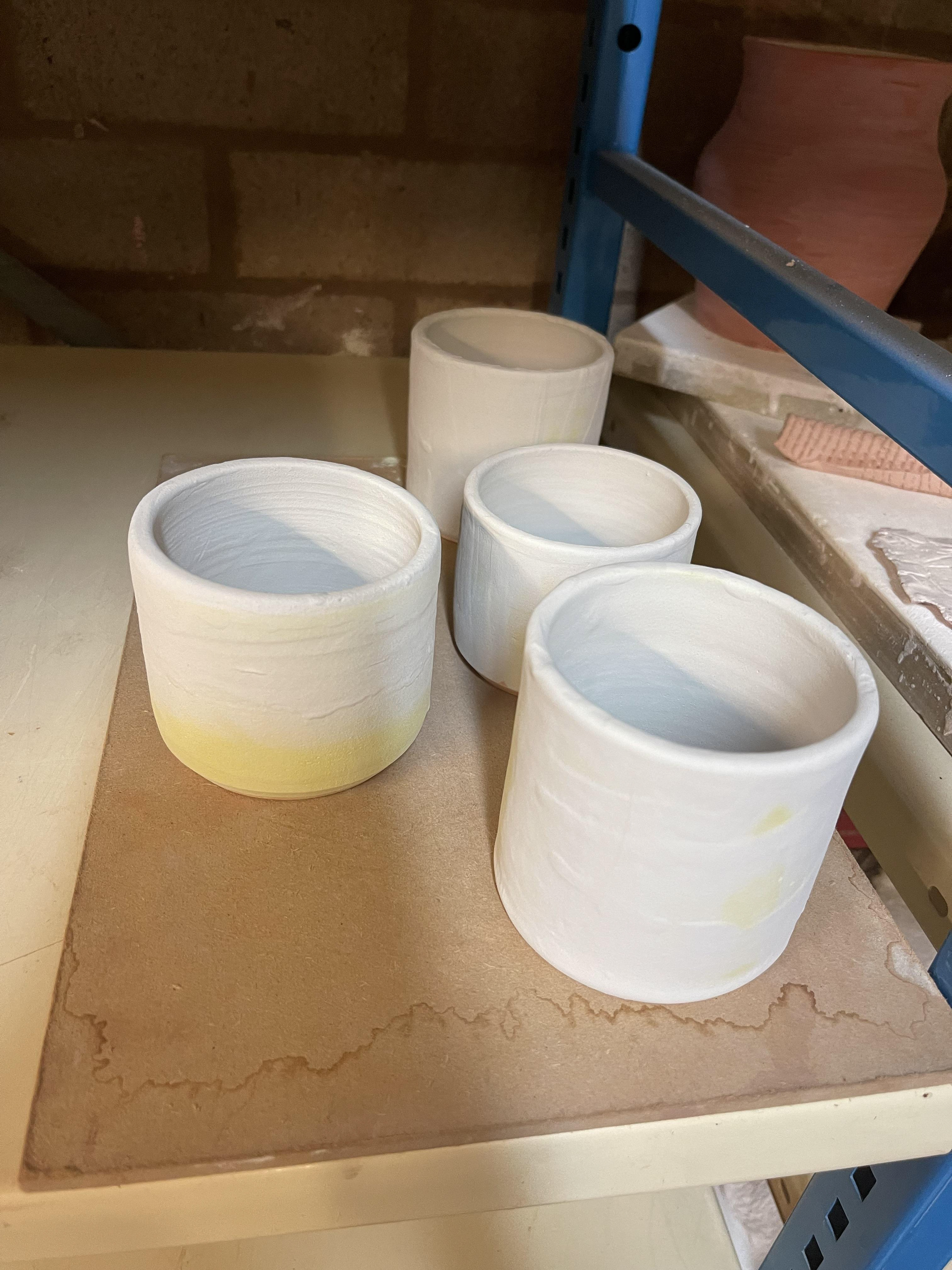
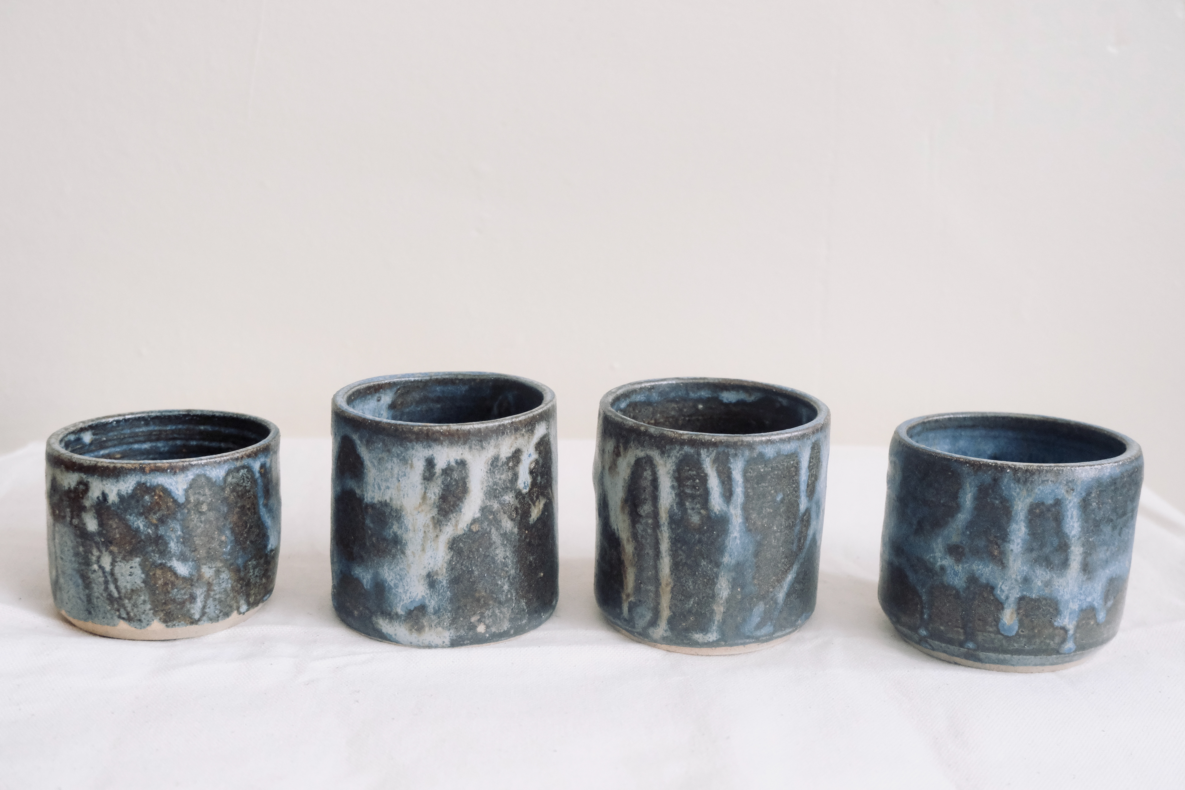
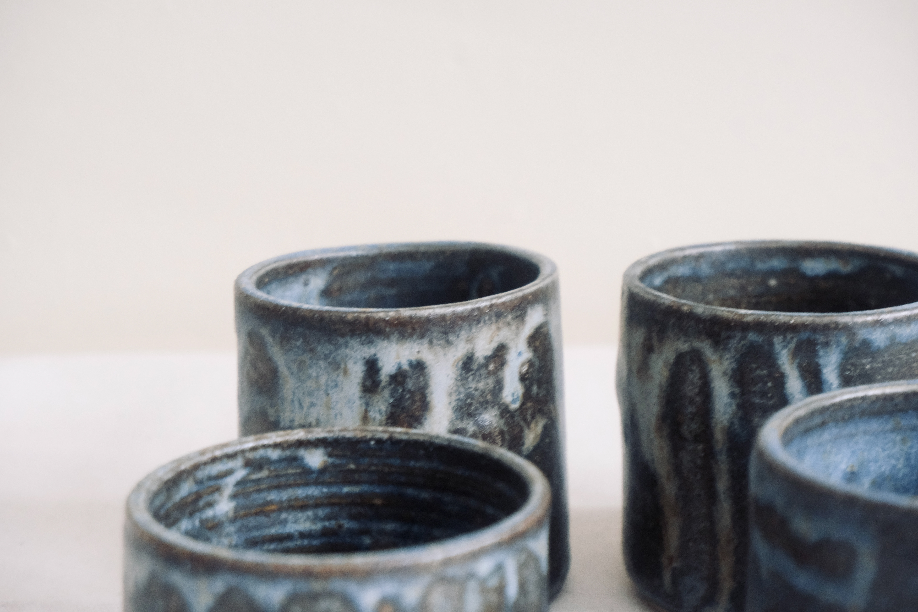
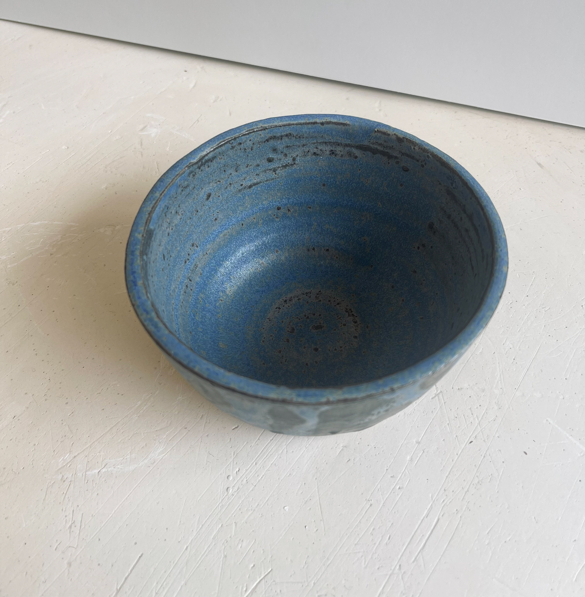
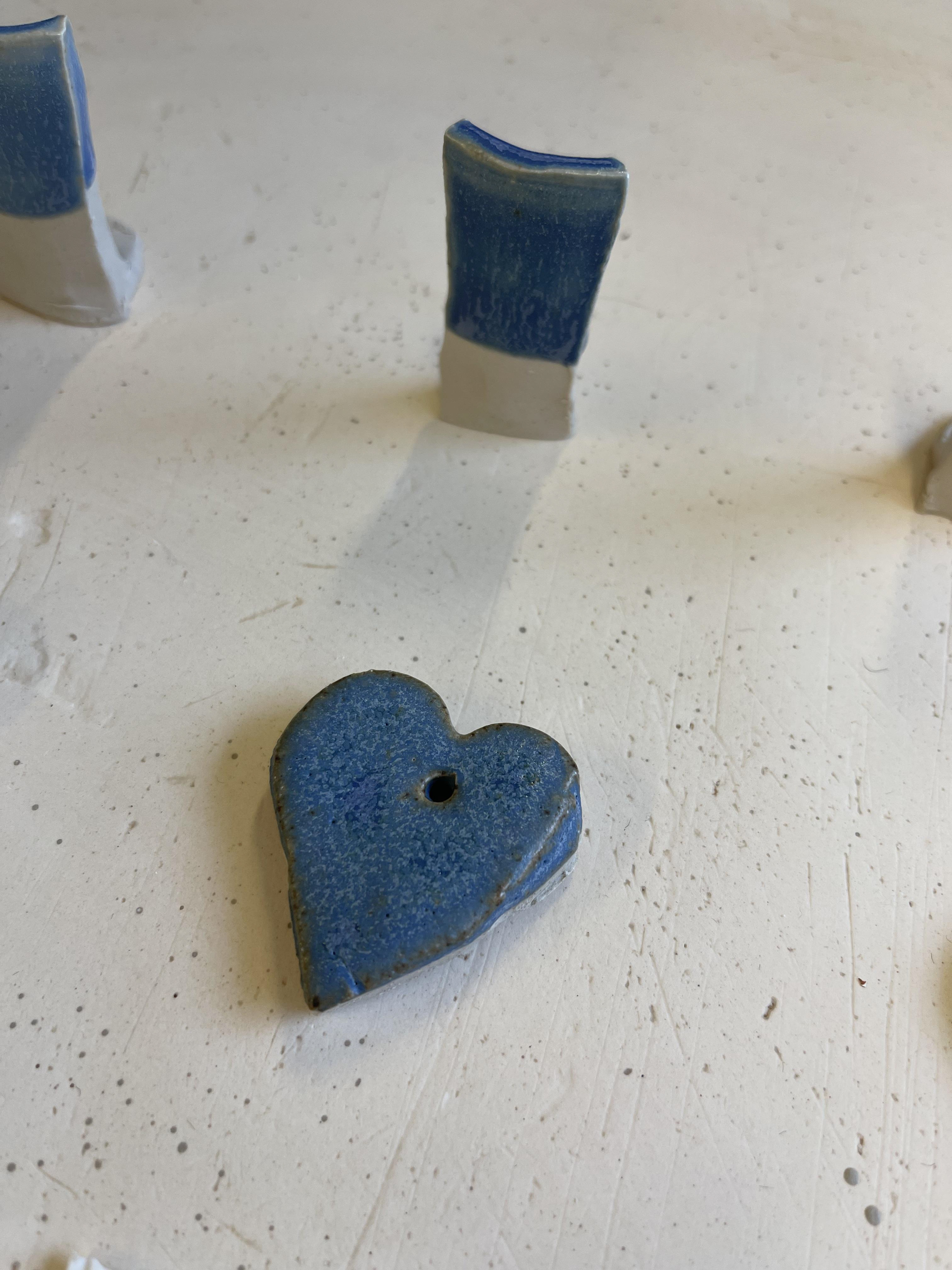
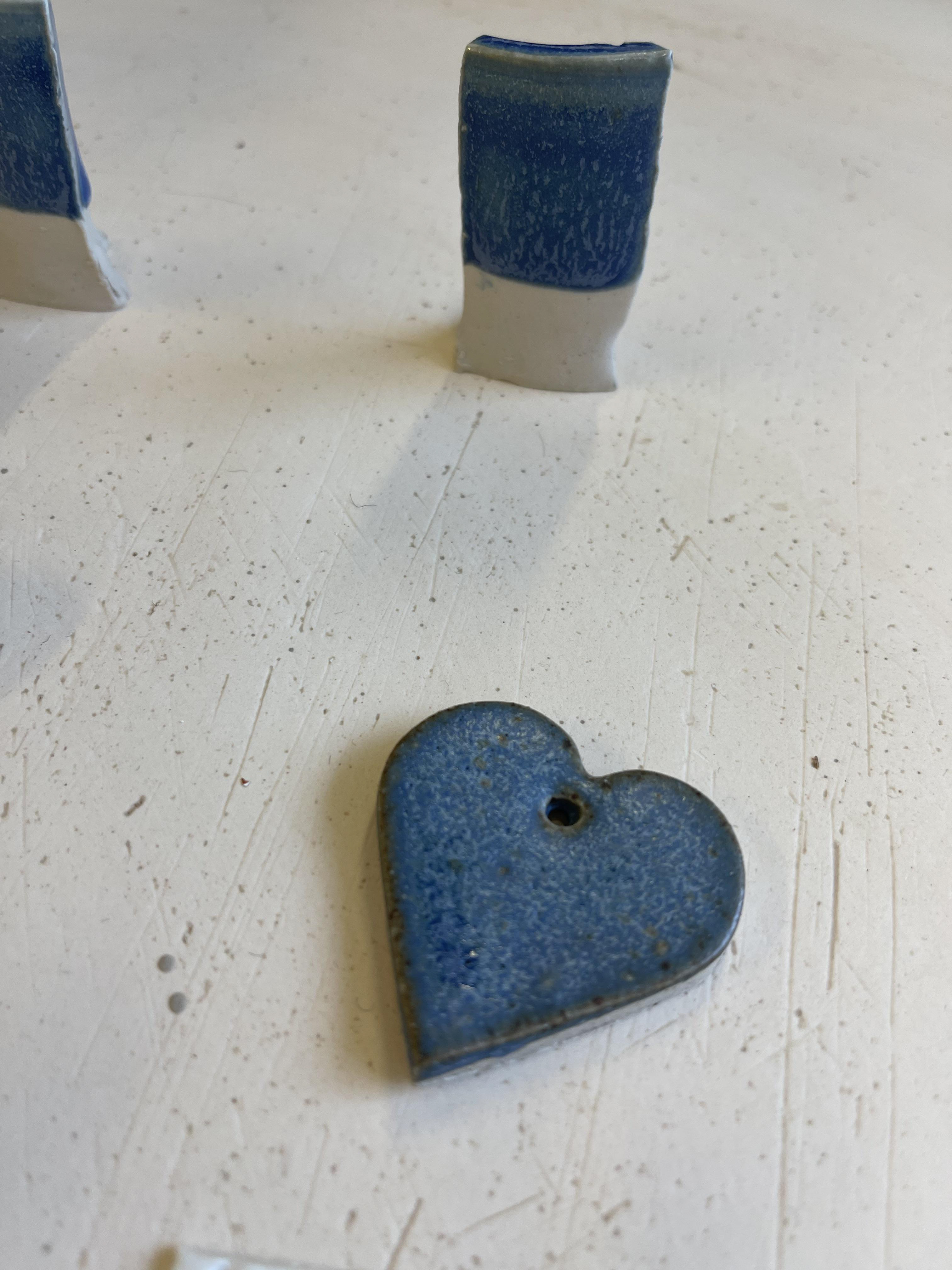
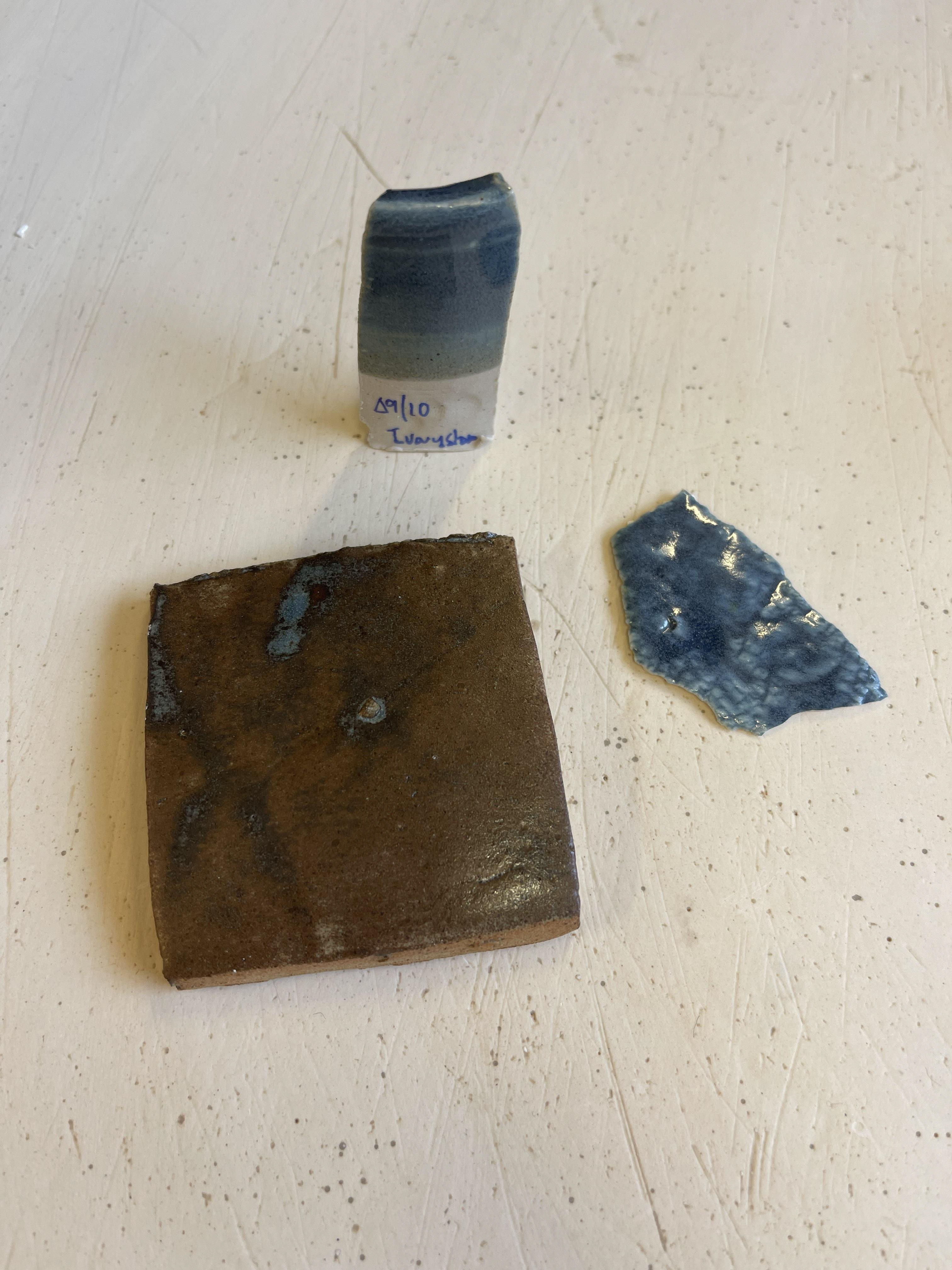
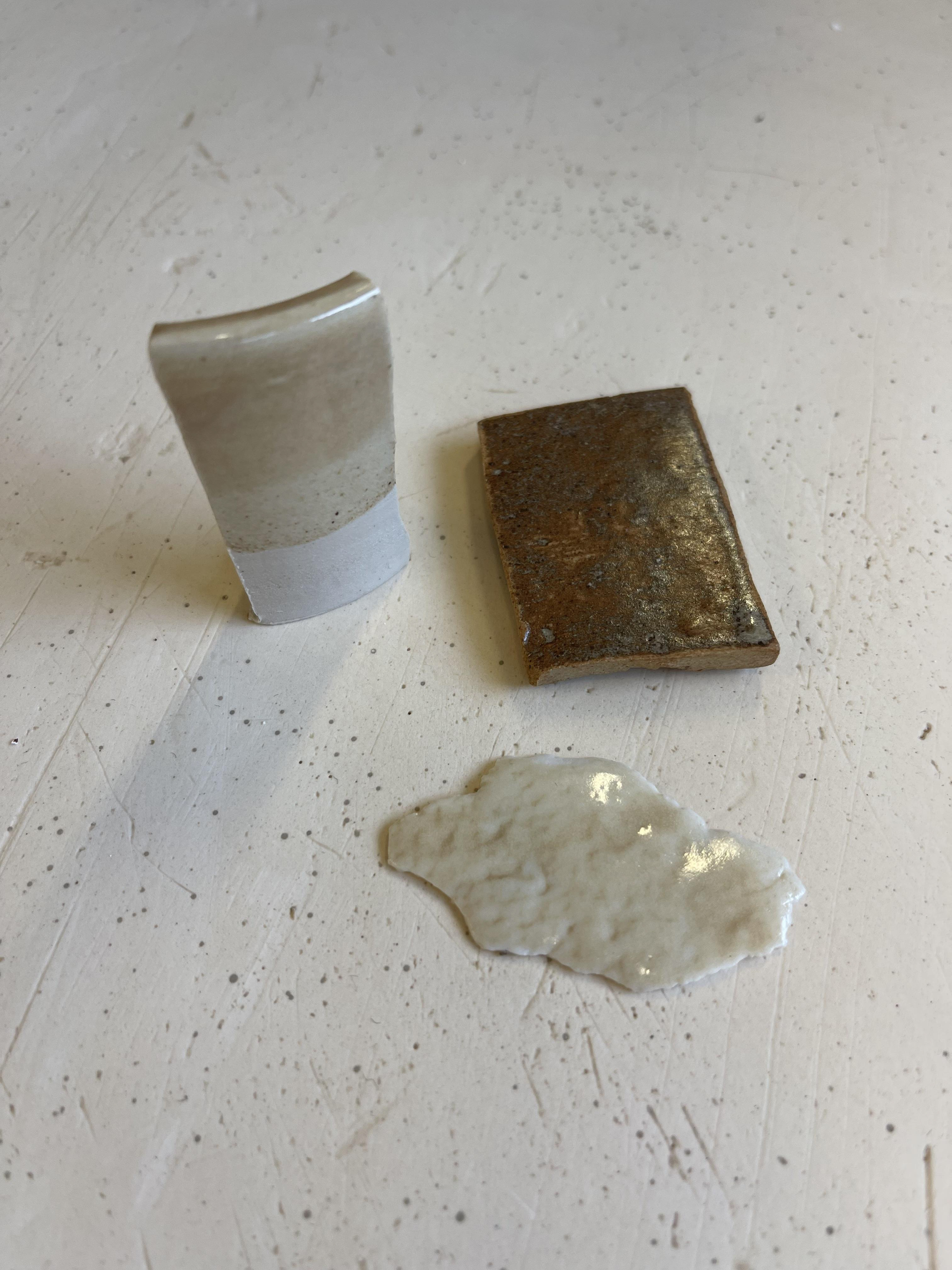
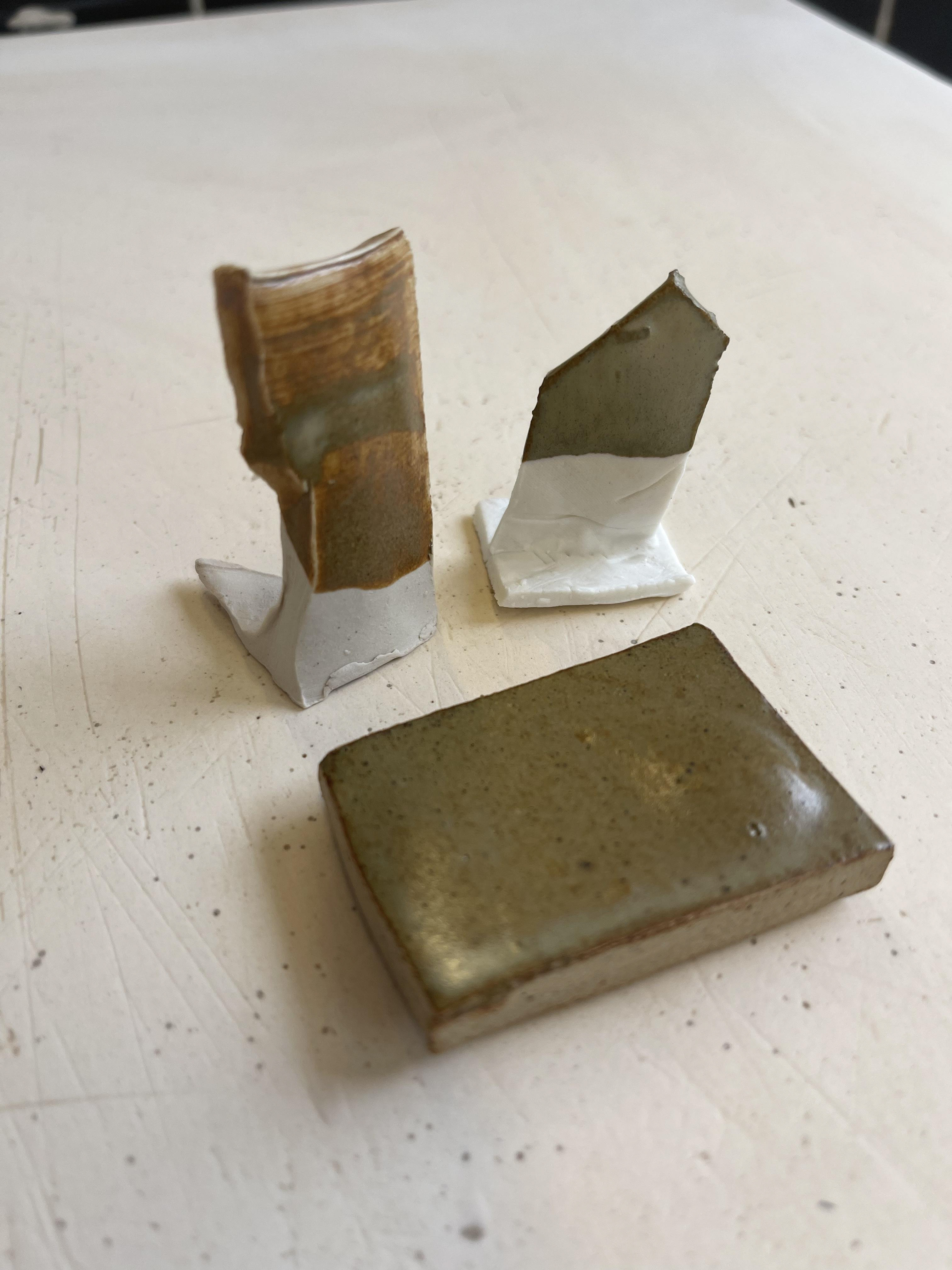
Vertical surface, ivorystoneware body, cone9/10, dipped application
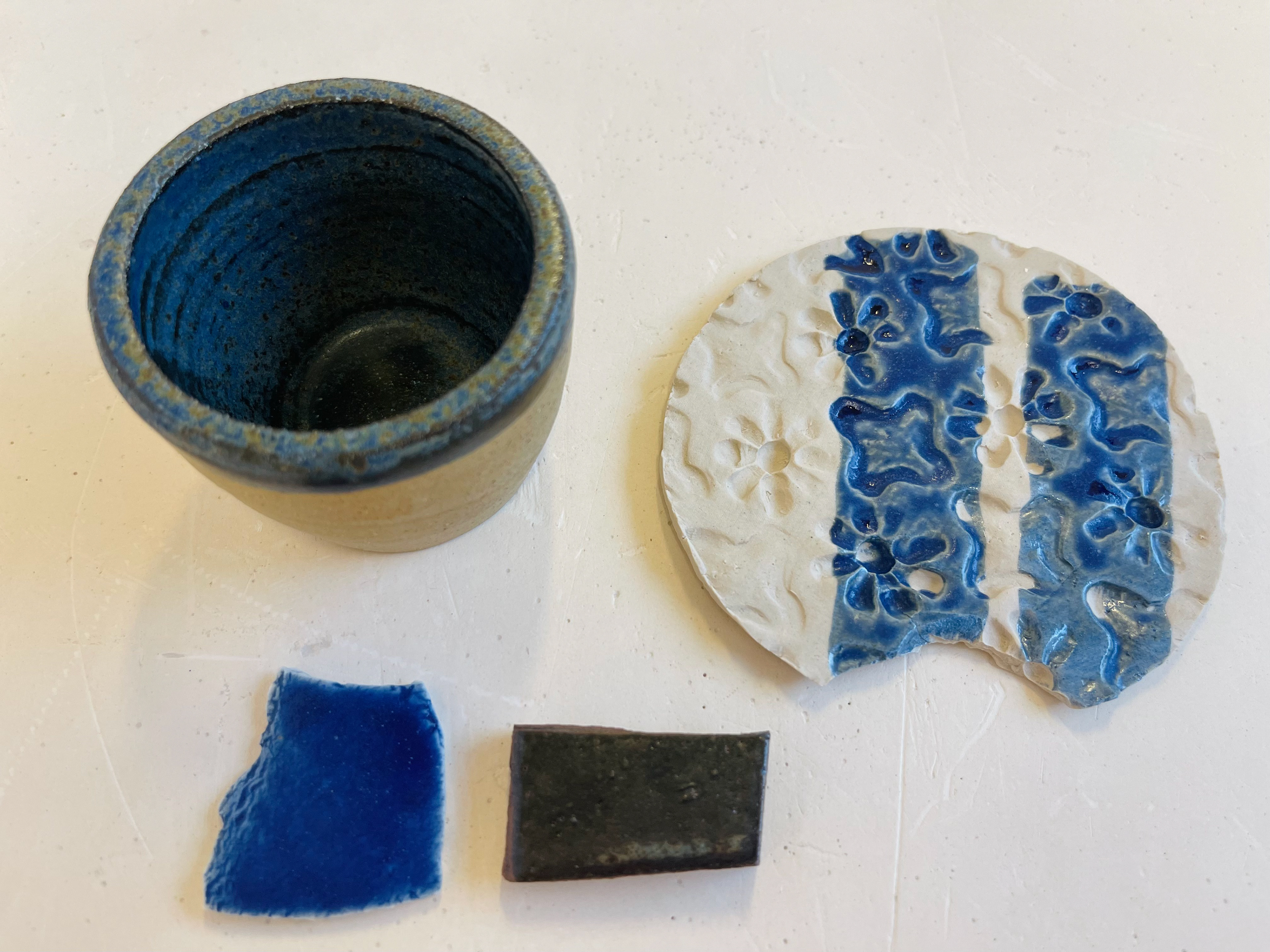
Cone 9/10, poured application, curved form, ivorystoneware body
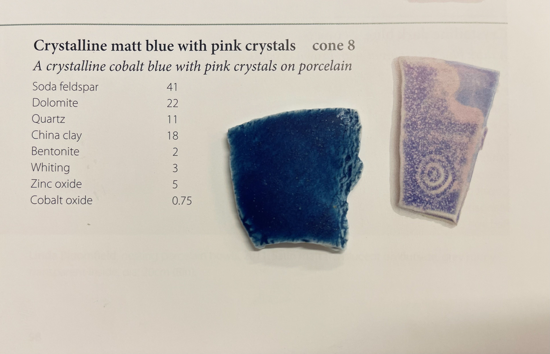
Before: 3secs dip, with cobalt.
Before: 3secs dip, without cobalt.
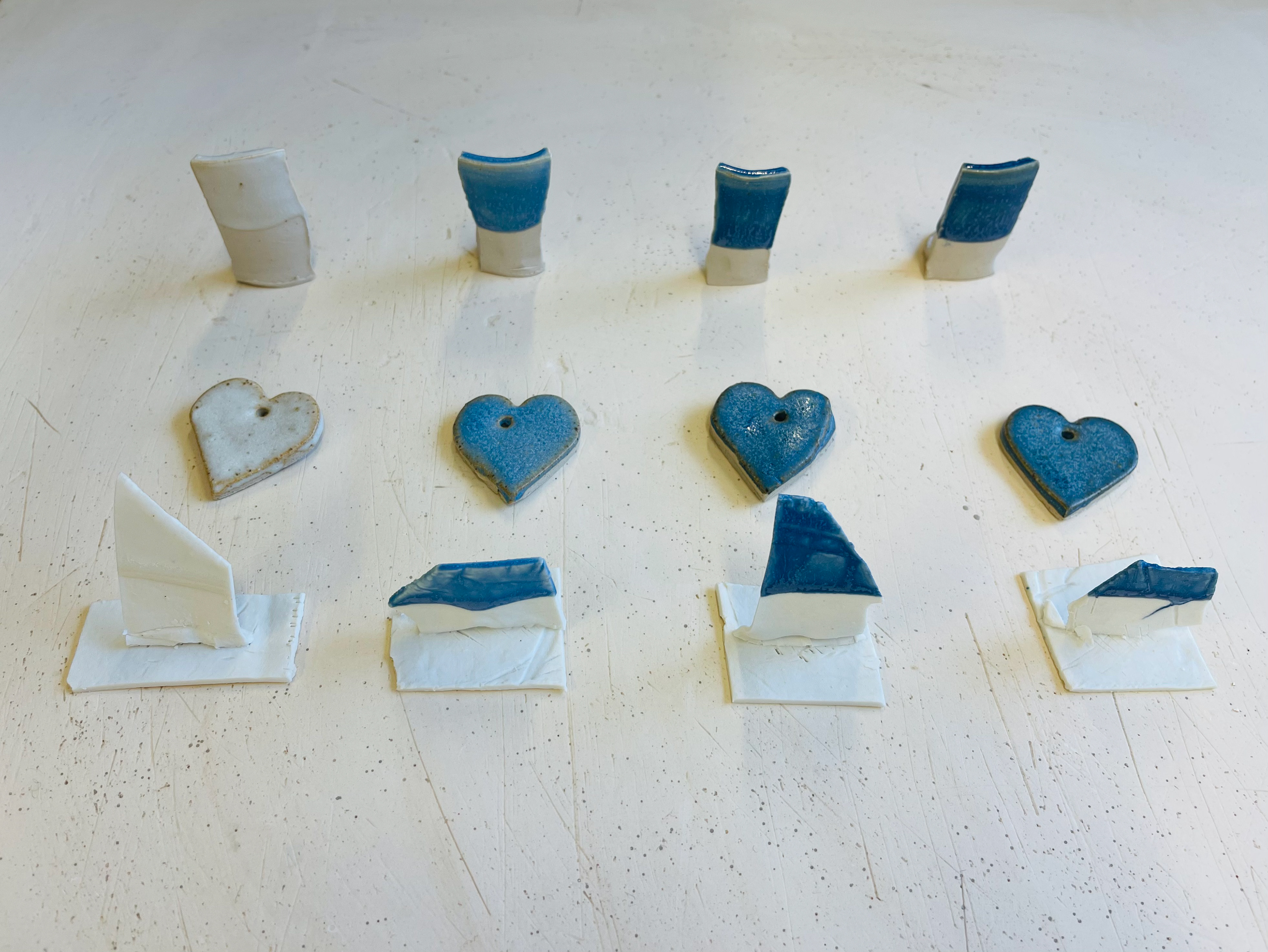
After: tested on: Almington, ivorystoneware and porcelain
After: tested on: Almington, ivorystoneware and porcelain


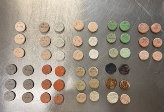
potash feldspar, almington clay body
soda feldpspar, white clay body
lithuim feldspar, white clay body
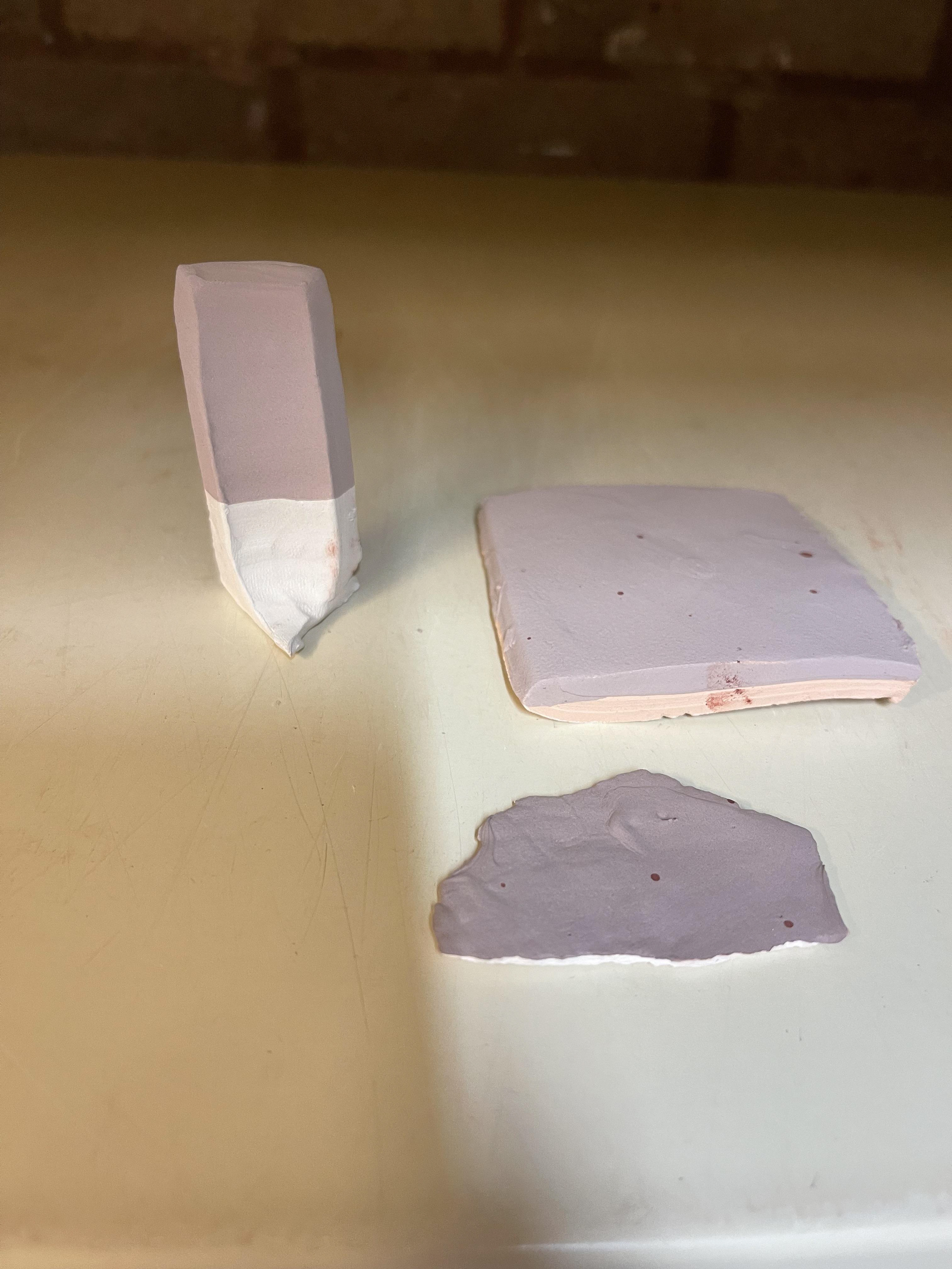
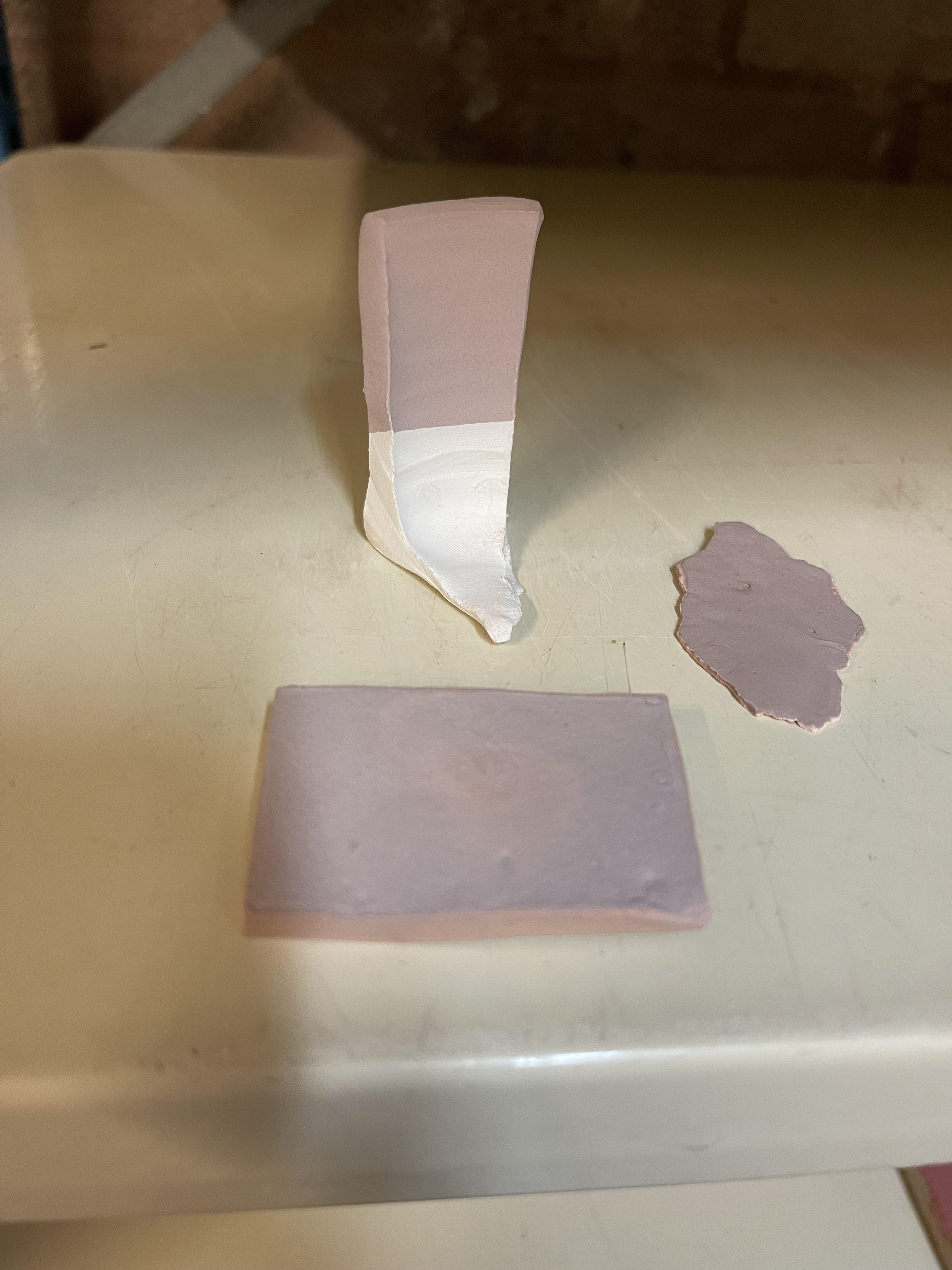
Before: Batch 1
Bisque fired batch 1
Before: Batch 2
Bisque fired batch 2

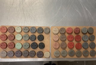
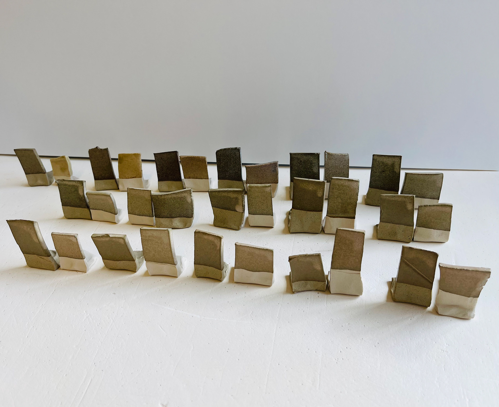
Glazed samples- front side (shiny sides)
Non glazed side- stoneware fired (not shiny)
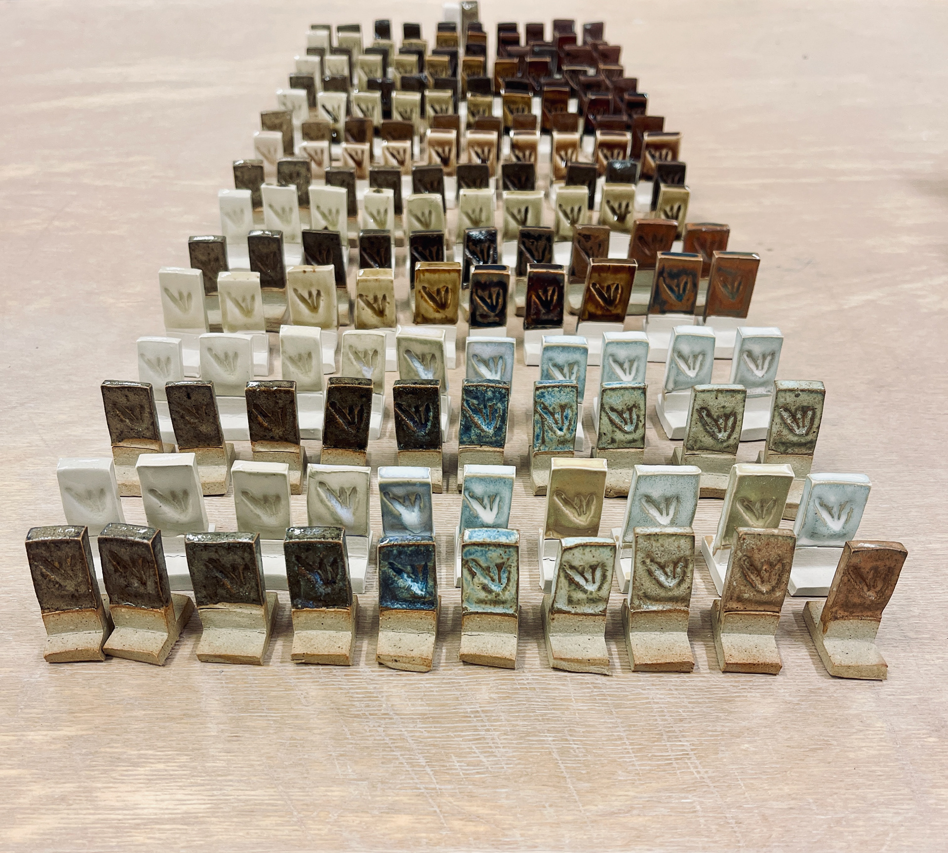
ALM and IVS clay body , fired to cone 9/10 (no soak time)
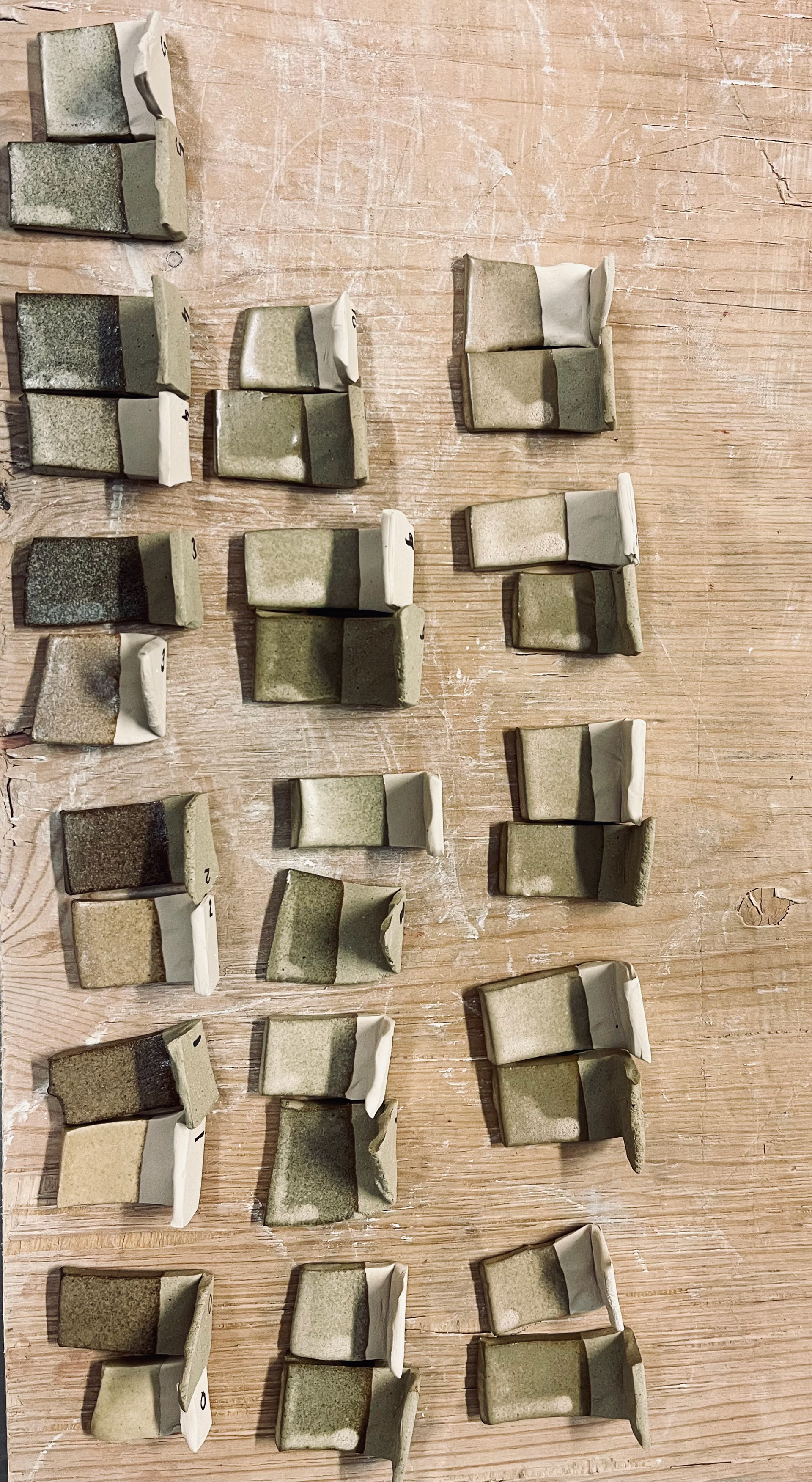
ALM and IVS clay body, cone8 with 20mins soak.
16%, 17% and 18% red iron oxide addition, cone 9/10 (no soak).
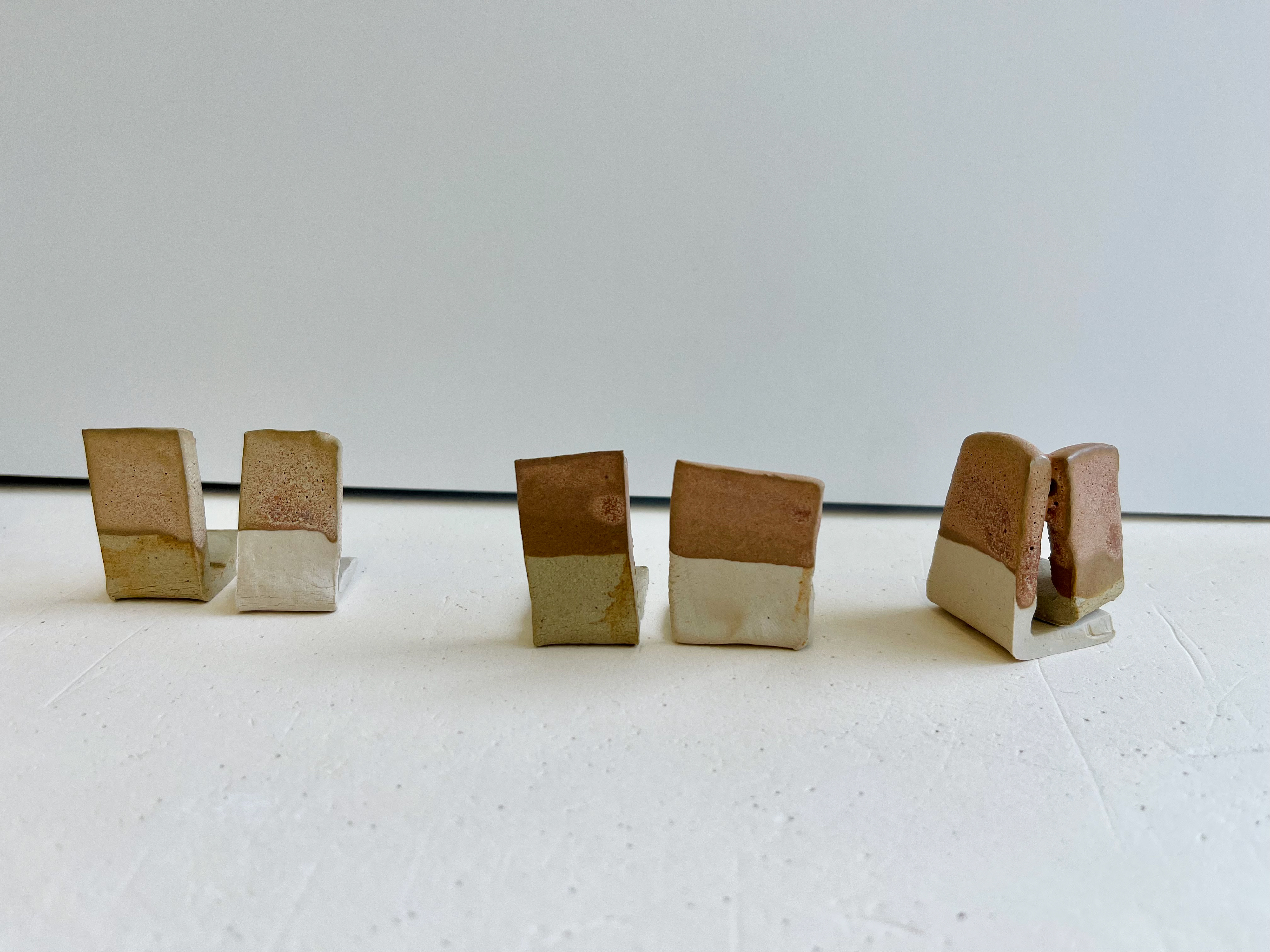
Pink colour achieved best results on whiter clay body but not food safe surface. Also pitted surface because of the gas release from the glaze.